The content of pages is divided into „Sections“. Those sections can have different background colors and contain all single elements, called „Blocks“. The margin between blocks within a section is always the same and smaller than the margin between different sections.
There are basically 2 different types of section, each one with a style variation. So we have 4 different types of sections. See how they look like on the sections page.
For every section there are the following content blocks to choose from:
This element is simply a headline. It can be styled in three different ways:
Heading - H1
Heading - H2
Heading - H3
Lead
Basically this block is just a text with a larger font size. It can be used e.g. for intros.
Lorem ipsum dolor sit amet, consectetur adipiscing elit, sed do eiusmod tempor incididunt ut labore et dolore magna aliqua. Ut enim ad minim veniam, quis nostrud exercitation ullamco laboris nisi ut aliquip ex ea commodo consequat. Duis aute irure dolor in reprehenderit in voluptate velit esse cillum dolore eu fugiat nulla pariatur. Excepteur sint occaecat cupidatat non proident, sunt in culpa qui officia deserunt mollit anim id est laborum.
Heading with lead
Combines heading + lead, but with smaller padding.
Lorem ipsum dolor sit amet, consectetur adipiscing elit, sed do eiusmod tempor incididunt ut labore et dolore magna aliqua. Ut enim ad minim veniam, quis nostrud exercitation ullamco laboris nisi ut aliquip ex ea commodo consequat. Duis aute irure dolor in reprehenderit in voluptate velit esse cillum dolore eu fugiat nulla pariatur. Excepteur sint occaecat cupidatat non proident, sunt in culpa qui officia deserunt mollit anim id est laborum.
Text (extendable with sidebar)
This block is a WYSIWYG-editor and should be used for text. It can be extended by a sidebar – find out more about the sidebar version on the sidebar page.
This is the element „Text (extendable with sidebar), but without a sidebar. Lorem ipsum dolor sit amet, this is bold consectetur adipiscing elit, sed do eiusmod tempor incididunt ut labore et dolore magna aliqua. Ut enim ad minim veniam, quis nostrud exercitation ullamco laboris nisi ut aliquip ex ea commodo consequat. This is italic and duis aute irure dolor in reprehenderit in voluptate velit esse cillum dolore eu fugiat nulla pariatur. Excepteur linked text to first section sint occaecat cupidatat non proident, sunt in culpa qui officia deserunt mollit anim id est laborum.
This is a video embedded within the textfield:
Commodo consequat. Duis aute irure dolor in reprehenderit in voluptate velit esse cillum dolore eu fugiat nulla pariatur. Excepteur sint occaecat cupidatat non proident, sunt in culpa qui officia deserunt mollit anim id est laborum.
This is an H2 heading and now comes an unordered list:
This is an unordered list
Lorem ipsum dolor sit amet, consectetur adipiscing elit, sed do eiusmod tempor incididunt ut labore et dolore magna aliqua. Ut enim ad minim veniam, quis nostrud exercitation ullamco.
Third item
Fourth
Commodo consequat. Duis aute irure dolor in reprehenderit in voluptate velit esse cillum dolore eu fugiat nulla pariatur. Excepteur sint occaecat cupidatat non proident, sunt in culpa qui officia deserunt mollit anim id est laborum.
This should be centered text.
This should be right aligned text.
This is an H3 heading and now comes an ordered list:
This is an ordered list
Lorem ipsum dolor sit amet, consectetur adipiscing elit, sed do eiusmod tempor incididunt ut labore et dolore magna aliqua. Ut enim ad minim veniam, quis nostrud exercitation ullamco.
Third item
Fourth
Excepteur sint occaecat cupidatat non proident, sunt in culpa qui officia deserunt mollit anim id est laborum.
Counter
This block counts from a starting figure to an ending figure, when scrolled into viewpoint. Also a title, text, a prefix and a suffix can be added. It can be used as full-width-element and in the sidebar of some blocks. Find out more about the sidebar version on the sidebar page.
Interesting percentage!
+100%
Lorem ipsum dolor sit amet, consectetur adipiscing elit, sed do eiusmod tempor incididunt ut labore et dolore magna aliqua.
Quote
The text for quote itself is the only mandatory field, but the block can also have an image, a name and a position. It can be used as full-width-element and in the sidebar of some blocks. Find out more about the sidebar version on the sidebar page.
This is a the "Quote" element. This text is the only mandatory field, but it can also have an image, a name and a position.
Fact box
This block shows multiple facts with predefined icons, that can be chosen. It can be used as full-width-element and in the sidebar of some blocks. Find out more about the sidebar version on the sidebar page.
Fact 1
Yuccie butcher readymade, mustache blog irony man braid banh mi normcore green juice la croix dreamcatcher taiyaki organic.
Fact 2 with a longer title
Yuccie butcher readymade, mustache blog irony man braid banh mi normcore green juice la croix dreamcatcher taiyaki organic.
Fact 3 is good, but without description
Fact 4
Yuccie butcher readymade, mustache blog irony man braid banh mi normcore green juice la croix dreamcatcher taiyaki organic.
Icon teaser
It shows a title, a text (with possible links) combined with an image/icon. It can be used as full-width-element and in the sidebar of some blocks. Find out more about the sidebar version on the sidebar page.
First one
Lorem ipsum dolor sit amet, consectetur adipiscing elit, sed do eiusmod.
The shortcode element can be used to show all types of registered shortcodes, like the audio-player-shortcode:
Form
The form element can be used to show a specific Gravity form. It can be extended by a sidebar – find out more about the sidebar version on the sidebar page.
Oops! Wir konnten dein Formular nicht lokalisieren.
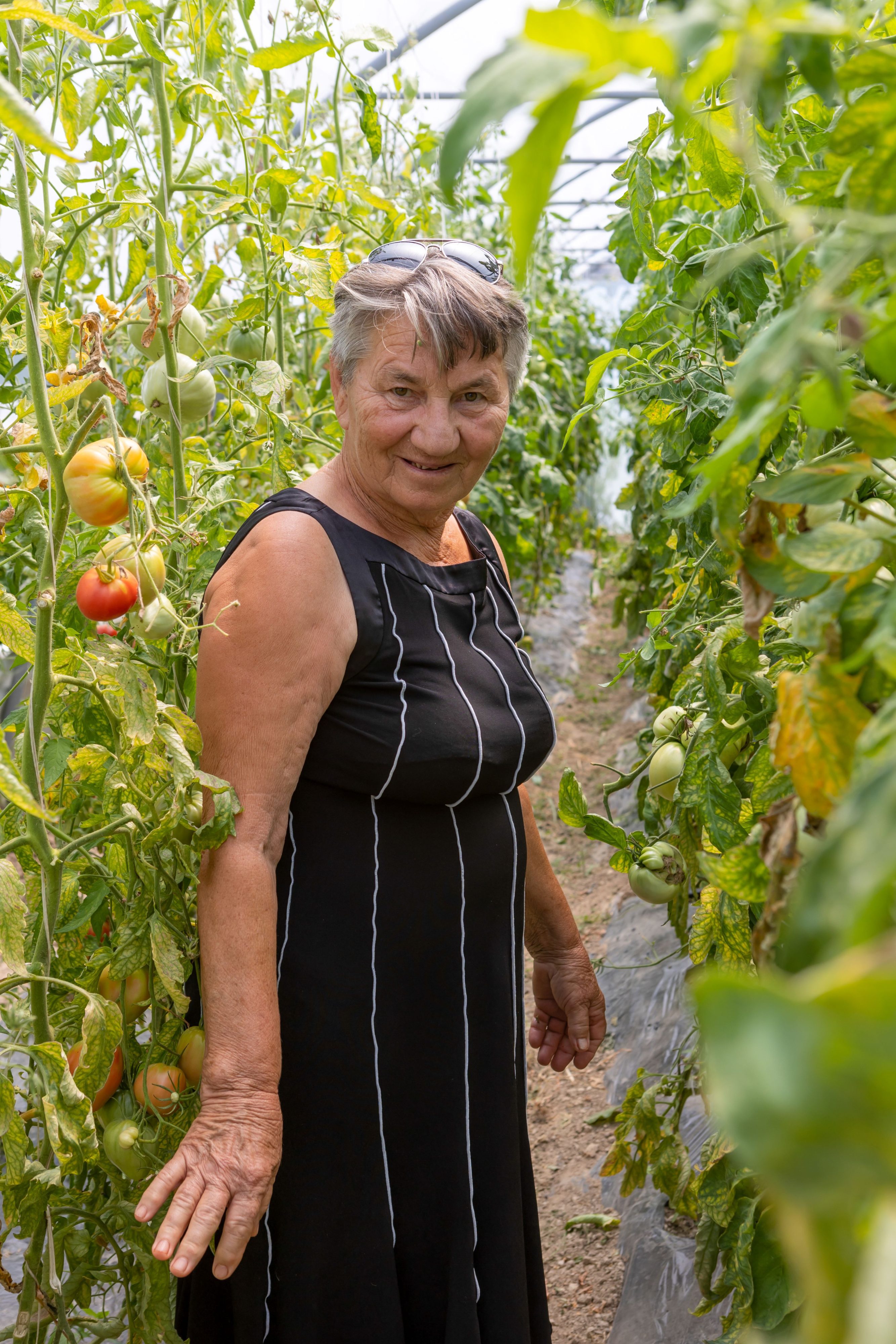
Image
Shows an image with or without a caption. Height is variable.
This is a portrait of a boy
Image slider
Shows images with or without captions in a slider format:
Image caption
Another caption
It can also be used to present only one image without a slider:
This is an image slider with only one image
Content slider
The content slider shows text (that is positioned left, centered or right) and an image caption on a full-width background image.
Teaser columns show multiple items with image, title and text. They can be linked and there are two grids available:
2 teasers per row:
Teaser columns 2 per row
Lorem ipsum dolor sit amet, consectetur adipiscing elit, sed do eiusmod tempor incididunt ut labore et dolore magna aliqua.
This is a tagline
Highlighted text
is very nice
Minim veniam, quis nostrud exercitation ullamco laboris nisi ut aliquip ex ea commodo consequat. Duis aute irure dolor in reprehenderit in voluptate velit.
Another one,
now with links
Reprehenderit in voluptate velit esse cillum dolore eu fugiat nulla pariatur. Excepteur sint occaecat cupidatat non proident, sunt in culpa qui officia deserunt mollit anim id est laborum.
Lorem ipsum dolor sit amet, consectetur adipiscing elit, sed do eiusmod tempor incididunt ut labore et dolore magna aliqua. Ut enim ad minim veniam, quis.
Ut enim ad minim veniam, quis nostrud exercitation ullamco laboris nisi ut aliquip ex ea commodo consequat. Duis aute irure dolor in reprehenderit in voluptate.
This block uses the same styling as the Teaser columns and can be used to show news or (active) projects. With no additional settings it just shows the most recent entries. Additional checkboxes allow to filter the posts through countries and/or topics.
2 latest projects (2 teaser per row):
3 latest news posts from countries "Austria" and "Germany" (3 teaser per row):
Wasser
Not in Syrien: „Wir konnten uns nicht einmal Wasser leisten“
–
Batul* und ihre Kinder leben seit Jahren in einem Lager für Vertriebene in Syrien. Es gibt kaum Arbeitsmöglichkeiten und damit auch kein Einkommen.
As the name says it is showing text on a (full-width) background-image. The text can be aligned left, centered or right and a link/button can be added.
Left aligned text with internal link:
Lorem ipsum dolor sit amet, consectetur adipiscing elit.
Sed do eiusmod tempor incididunt ut labore et dolore magna aliqua. Ut enim ad minim veniam, quis.
Center aligned text with external link:
Lorem ipsum dolor sit amet consectetur adipiscing elit, sed do eiusmod tempor incididunt ut labore et dolore magna aliqua. Ut enim ad minim veniam, quis.
Ipsum dolor sit amet consectetur adipiscing elit, sed do eiusmod tempor incididunt ut labore et dolore magna aliqua. Ut enim ad minim veniam, quis.
Ipsum consectetur adipiscing elit, sed do eiusmod tempor incididunt ut labore et dolore magna aliqua. Ut enim ad minim veniam, quis.
Uullamco laboris nisi ut aliquip ex ea commodo consequat. Duis aute irure dolor in reprehenderit in voluptate velit esse cillum dolore eu fugiat nulla pariatur. Excepteur sint occaecat cupidatat non proident, sunt in culpa.
Shows a predefined Dadi donation widget. The whole configuration of the widgets is done globally under Donation widgets. This block makes it possible to choose, which of the predefined widgets you want to show. It can be extended by a sidebar – find out more about the sidebar version on the sidebar page.
Donation widget multistep
Shows a predefined Dadi donation widget. The whole configuration of the widgets is done globally under Donation widgets. This block makes it possible to choose, which of the predefined widgets you want to show. It can be extended by a sidebar – find out more about the sidebar version on the sidebar page.
Donation Shop
Shows a predefined Dadi donation widget. The whole configuration of the widgets is done globally under Donation widgets. This block makes it possible to choose, which of the predefined widgets you want to show. It can be extended by a sidebar – find out more about the sidebar version on the sidebar page.
This block can show maps, which are created by the WordPress Plugin MapSVG. Notice: If you click on the USA you will see a popup.
[mapsvg id="9074"]
Legend
The legend block is designed to add explaining information to figures, for example to a map.
Dark blue countries
Light blue countries
Accordion
This block shows multiple items with title + text. The text is hidden and can be shown, when you click on the title or the open-icon:
First accordion item
Lorem ipsum dolor sit amet, consectetur adipiscing elit, sed do eiusmod tempor incididunt ut labore et dolore magna aliqua. Ut enim ad minim veniam, quis nostrud exercitation ullamco laboris nisi ut aliquip ex ea commodo consequat. Duis aute irure dolor in reprehenderit in voluptate velit esse cillum dolore eu fugiat nulla pariatur. Excepteur sint occaecat cupidatat non proident, sunt in culpa qui officia deserunt mollit anim id est laborum.
Second one, this is the title
Ut enim ad minim veniam, quis nostrud exercitation ullamco laboris nisi ut aliquip ex ea commodo consequat. Duis aute irure dolor in reprehenderit in voluptate velit esse cillum dolore eu fugiat nulla pariatur. Excepteur sint occaecat cupidatat non proident, sunt in culpa qui officia deserunt mollit anim id est laborum.
Nostrud exercitation ullamco laboris nisi ut aliquip ex ea commodo consequat. Duis aute irure dolor in reprehenderit in voluptate velit esse cillum dolore eu fugiat nulla pariatur. Excepteur sint occaecat cupidatat non proident, sunt in culpa qui officia deserunt mollit anim id est laborum.
Lorem ipsum dolor sit amet, consectetur adipiscing elit, sed do eiusmod tempor incididunt ut labore et dolore magna aliqua. Ut enim ad minim veniam, quis nostrud exercitation ullamco laboris nisi ut aliquip ex ea commodo consequat. Duis aute irure dolor in reprehenderit in.
Social sharing
Adds social sharing buttons to the page (WhatsApp, Twitter, Facebook, E-Mail):
Wolfgang Bogensberger, Stv. Leiter der EU-Kommission in Wien, im CARE-Podcast
Andrea Barschdorf-Hager spricht mit dem Stv. Leiter der EU-Kommission in Wien, Wolfgang Bogensberger, über die globale Rolle der Europäischen Union, wie Werte und Ideale die Zusammenarbeit mit Partnern im Globalen Süden beeinflussen, welche Herausforderungen der kommende Wiederaufbau in der Ukraine mit sich bringt und den sehr unterschiedlichen Umgang mit geflüchteten Menschen in Europa.


 Fact 1
Yuccie butcher readymade, mustache blog irony man braid banh mi normcore green juice la croix dreamcatcher taiyaki organic.
Fact 1
Yuccie butcher readymade, mustache blog irony man braid banh mi normcore green juice la croix dreamcatcher taiyaki organic.
 Fact 2 with a longer title
Yuccie butcher readymade, mustache blog irony man braid banh mi normcore green juice la croix dreamcatcher taiyaki organic.
Fact 2 with a longer title
Yuccie butcher readymade, mustache blog irony man braid banh mi normcore green juice la croix dreamcatcher taiyaki organic.
 Fact 3 is good, but without description
 Fact 4
Yuccie butcher readymade, mustache blog irony man braid banh mi normcore green juice la croix dreamcatcher taiyaki organic.
Fact 4
Yuccie butcher readymade, mustache blog irony man braid banh mi normcore green juice la croix dreamcatcher taiyaki organic.


